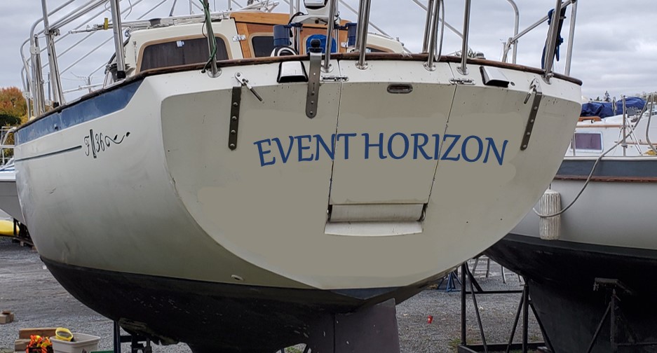
Thanks @TomY I had not thought about font yet. I like the idea of matching the font on the quarter. I was planning on fitting it around the swim ladder cutout so the letters don't need to be cut across the breaks. The curve matching the top of the transom is a good idea, I'll have to see how best to draw that out. Now that you point it out, the current name on the transom is bothering me even more. Your Adventuress example looks very good.
New adventure, new boat
- Thread starter DArcy
- Start date
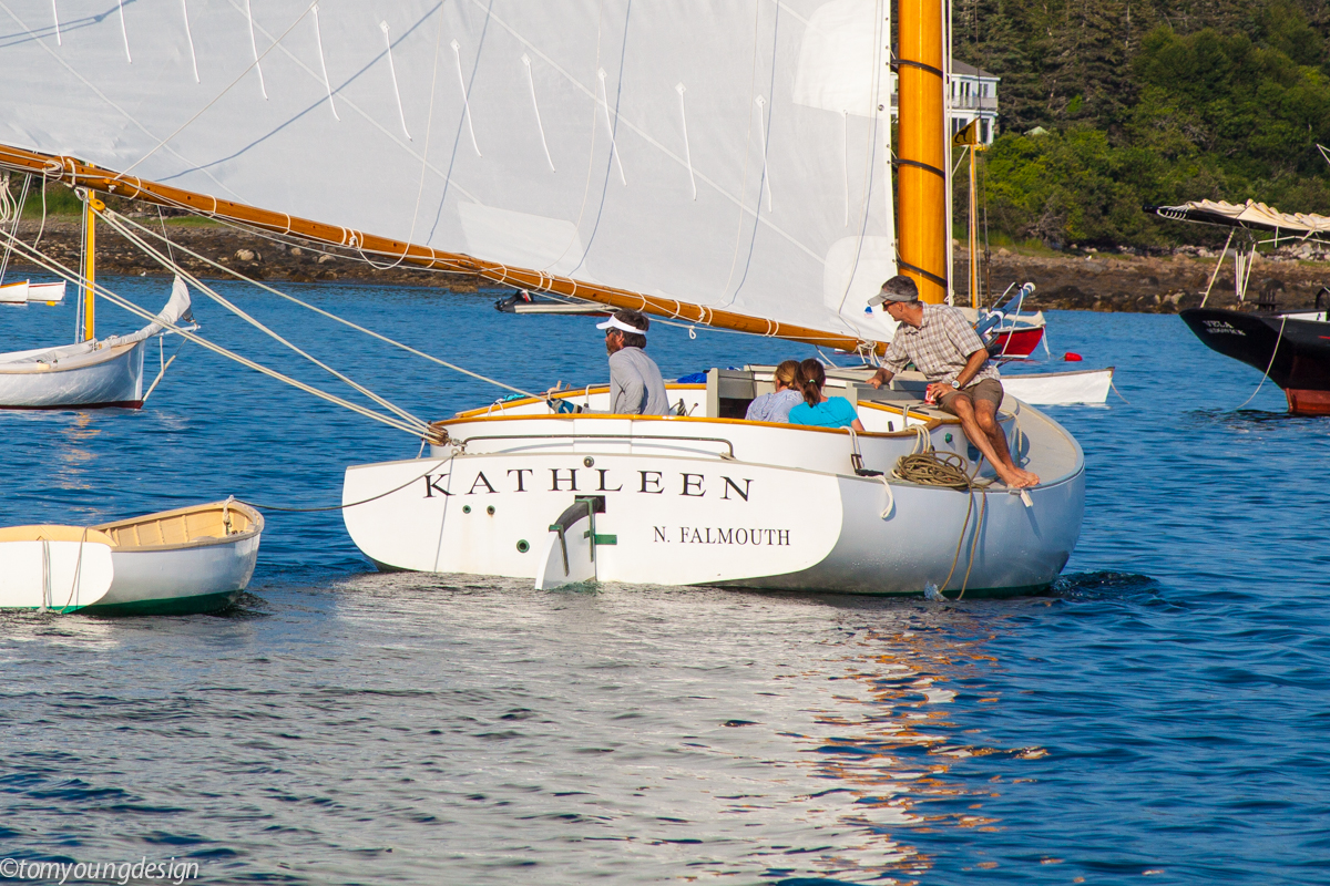
Your swim ladder will drive your design. Here's a bigger transom than yours. The letters are even longer - stretched, than INTERGRITY's but they are lighter (not as bold). The letters are spaced quite wide which would enable it to bridge the cuts in a swim ladder.
But KATHLEEN follows the arc of the transom nicely. Big letters but looks better than INTEGRITY's bold, close font.
Falmouth on the other hand is different on the straight line, and accents the arc above. Plus, challenged by the rudder, they move it and it looks fine.
Just showing you can make anything work with a little design.
I finally have a new name for the boat: EVENT HORIZON
It was a bit of an ordeal. There were 4 forms to fill out, two months after submitting the forms (and payment) I received an email saying two of the forms had errors, one being the bill of sale. I reached out to the PO who very quickly sent me an amended copy and I fixed the other form and sent them in. It seems once the file lands on the desk the federal registration office is very responsive and the next day I had my registration... almost.
One of the things I wanted in the name was to not have a trailing number and the registration was for EVENT HORIZON I. I wrote back thanking them for the expedient response and mentioned I was curious why I didn't get my first choice without the "I". He said it was taken so I wrote back saying it didn't show up on the online vessel listing and I sent a screen capture. He quickly wrote back saying I was right and he really thought he saw the listing (there is an EVENT HORIZON II). He re-sent the registration and EVENT HORIZON is now officially registered
When it warms up I will get the new name on the boat - taking Tom's advice on the design of course!
Something like this
Great TV show... there was also the movie by the name "Event Horizon"DArcy, cool looking boat. I love the new name. Makes me wonder if you watch the TV show, "The Expanse".
The astronomical definition of an event horizon is that radius around a black hole where light can't escape. It has come to mean a point of no return, and in physics, I was fascinated by the idea that there was a point at which the gravitational force at the closer half of a body to a large mass were so much more powerful than the force of attraction at the farther end, that the body could actually be pulled apart by gravitational acceleration as it overcomes the inertia at the other end.
This is how I see the name on the OP's sailboat. The attraction of the horizon overcomes the inertia of staying in port. It virtually tears the docklines apart as it draws the boat to sea.
-Will (Dragonfly)
This is how I see the name on the OP's sailboat. The attraction of the horizon overcomes the inertia of staying in port. It virtually tears the docklines apart as it draws the boat to sea.
-Will (Dragonfly)
Well, I've never heard of "The Expanse" and never seen the "Event Horizon" but now I'm going to have to watch them 
The admiral came up with the name, she saw it on a TV show and liked it. I immediately thought of the black hole reference but then the idea of heading for the horizon with no going back. I like the way @Will Gilmore describes it - a force so strong it pulls the boat and breaks the dock lines heading to sea.
The admiral came up with the name, she saw it on a TV show and liked it. I immediately thought of the black hole reference but then the idea of heading for the horizon with no going back. I like the way @Will Gilmore describes it - a force so strong it pulls the boat and breaks the dock lines heading to sea.
.... but let us not dwell on the "point of no return" metaphor... That is a deep rabbit hole for just about everyone on this list serve .

